In addition to representing the university, our colors were chosen with accessibility and differentiation in mind.
Jump to Web Color
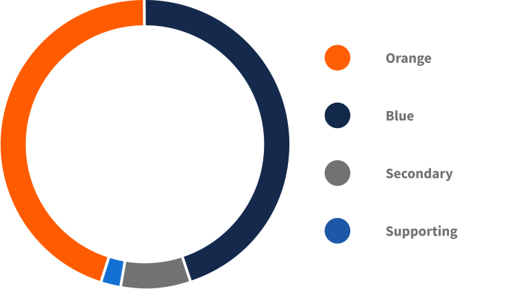
Primary Colors
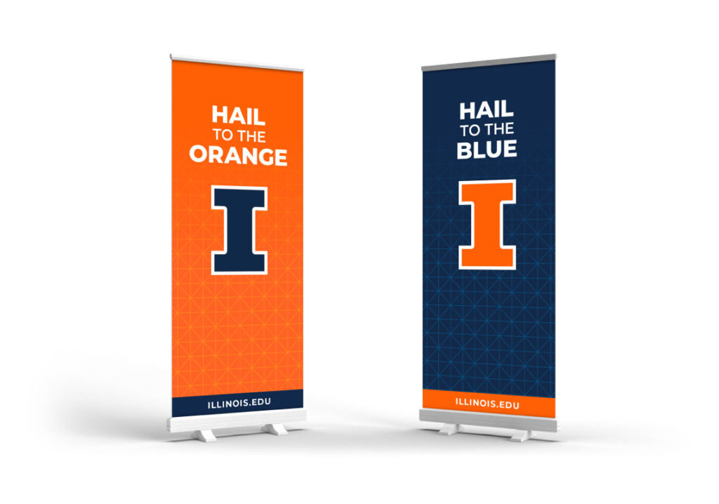
Illini orange and Illini blue are central to our brand identity and should be the dominant colors used in university designs. Research shows orange is the color most identified with our brand.
We encourage orange being incorporated as much as blue.
Illini Orange
PMS 1655
CMYK 0/80/100/0
#FF5F05
RGB 255/95/5
Illini Blue
PMS 2767
CMYK 100/90/10/50
#13294B
RGB 19/41/75
Secondary Colors
Our secondary colors provide additional, neutral color options to supplement Illini orange and Illini blue on a limited basis. With the exception of white, these should only be used minimally as necessary or in applications where it’s not possible to use only Illini orange or Illini blue. The use of additional neutral colors is not permitted.
Storm
#707372
CMYK 30/20/19/58
#9C9A9D
CMYK 18/12/11/35
#C8C6C7
CMYK 7/5/5/14
#FFFFFF
CMYK 0/0/0/0
#000000
CMYK 50/40/30/100
Supporting Colors
Some specialized designs require additional colors for functional use. Our supporting colors complement our primary and secondary colors, but should not compete with them. They should be used only when necessary and should never be used in place of Illini orange or Illini blue.
Only use supporting colors to enhance icons and make charts, infographics and graphs more readable. They should never be used for large floods of background colors.
Industrial
#1D58A7
RGB 29/88/167
CMYK 90/48/0/0
Arches
#009FD4
RGB 0/159/212
CMYK 70/5/2/0
Patina
#007E8E
RGB 0/126/142
CMYK 93/34/39/5
Berry
#5C0E41
RGB 92/14/65
CMYK 53/100/42/43
Harvest
#FCB316
RGB 252/179/22
CMYK 0/20/60/0
Prairie
#006230
RGB 0/98/48
CMYK 100/13/100/44
Earth
#7D3E13
RGB 125/62/19
CMYK 33/76/100/36
Using Color
All university designs must use Illini orange and Illini blue as the dominant colors in the available design space. They are our primary colors and should be used boldly. Designers should not feel compelled to use the entire palette and instead should aim to use the fewest number of secondary and supporting colors possible. Only introduce secondary and supporting colors when necessary.
Tints
In very rare cases, you may need a tint of a supporting color to display complex information. You can use 80%, 60%, 40% and 20% versions of the supporting colors if needed. You should never use a tint of a color if you don’t use the 100% version.
Accessibility
No matter what form design work takes, it is critical to prioritize accessibility. In both digital and print design, color plays a large role in whether content is accessible or not. Ensure there’s enough color contrast between text and background elements for users to easily view and engage with the content. For more information on how the university brand colors can be used together in an accessible way, please reference the example images and guidance in the accordion menus below.
Altgeld orange for accessibility
Altgeld orange was built to serve as an accessible option when Illini orange does not provide enough color contrast — for example, when using orange type at a small size or when orange is on light gray. It provides the appropriately accessible contrast to be inclusive of our diverse audience needs. Only use Altgeld orange to aid in meeting contrast and legibility accessibility requirements.
Altgeld
#C84113, RGB 200/65/19, CMYK 0/68/91/22
Hosted Brand Assets for Web
Our color codes have been added to the collection of hosted brand assets, also known as a content delivery network (CDN), so you can implement them to your website with simplified variable names. Find the documentation on all the hosted brand assets.
Web Color Pairings for Accessibility
To help you create consistent, accessible designs, use the color pairings below. Color pairings change based on the background color. University websites should not introduce additional supporting colors, unless used in charts, graphs or infographics. Below are several examples of accessible color pairings as well as guidance for each color background.


White background
| Color | Variable Name | Hex Code | Regular Font Size | Bold Font Size | Proper Usage |
|---|---|---|---|---|---|
 | white | #ffffff | Not applicable | Not applicable | Background |
 | il-storm-10 | #252525 | All sizes | All sizes | Default body text |
 | il-industrial | #1d58a7 | All sizes | All sizes | Default body text link |
 | il-altgeld | #c84113 | All sizes | All sizes | Default body text link hover/focus |
 | il-blue | #13294b | All sizes | All sizes | Default heading |
| il-blue | #13294b | All sizes | All sizes | Default heading link |
 | il-orange | #ff5f05 | Accessible at 24px or larger | Accessible at 18.66px or larger | Default heading link hover/focus |
Limited use options
| Color | Variable Name | Hex Code | Regular Font Size | Bold Font Size | Proper Usage |
|---|---|---|---|---|---|
| il-orange | #ff5f05 | Accessible at 24px or larger | Accessible at 18.66px or larger | Specialty heading |
| il-orange | #ff5f05 | Accessible at 24px or larger | Accessible at 18.66px or larger | Specialty heading link |
| il-blue | #13294b | All sizes | All sizes | Specialty heading hover/focus |
Gray background
| Color | Variable Name | Hex Code | Regular Font Size | Bold Font Size | Proper Usage |
|---|---|---|---|---|---|
 | il-storm-95 | #f4f4f4 | Not applicable | Not applicable | Background |
| il-storm-10 | #252525 | All sizes | All sizes | Default body text |
| il-industrial | #1d58a7 | All sizes | All sizes | Default body text link |
| il-altgeld | #c84113 | All sizes | All sizes | Default body text link hover/focus |
| il-blue | #13294b | All sizes | All sizes | Default heading |
| il-blue | #13294b | All sizes | All sizes | Default heading link |
| il-altgeld | #c84113 | Accessible at 24px or larger | Accessible at 18.66px or larger | Default heading link hover/focus |
Limited use options
| Color | Variable Name | Hex Code | Regular Font Size | Bold Font Size | Proper Usage |
|---|---|---|---|---|---|
| il-altgeld | #c84113 | Accessible at 24px or larger | Accessible at 18.66px or larger | Specialty heading |
| il-altgeld | #c84113 | Accessible at 24px or larger | Accessible at 18.66px or larger | Specialty heading link |
| il-blue | #13294b | All sizes | All sizes | Specialty heading hover/focus |
Orange background
| Color | Variable Name | Hex Code | Regular Font Size | Bold Font Size | Proper Usage |
|---|---|---|---|---|---|
| il-orange | #ff5f05 | Not applicable | Not applicable | Background |
| il-blue | #13294b | All sizes | All sizes | Default body text |
| il-blue | #13294b | All sizes | All sizes | Default body text link |
| il-blue | #13294b | All sizes | All sizes | Default body text link hover/focus |
| white | #ffffff | All sizes | All sizes | Default heading |
| white | #ffffff | All sizes | All sizes | Default heading link |
| il-blue | #13294b | Accessible at 24px or larger | Accessible at 18.66px or larger | Default heading link hover/focus |
Blue background
| Color | Variable Name | Hex Code | Regular Font Size | Bold Font Size | Proper Usage |
|---|---|---|---|---|---|
| il-blue | #13294b | Not applicable | Not applicable | Background |
| white | #ffffff | All sizes | All sizes | Default body text |
| white | #ffffff | All sizes | All sizes | Default body text link |
| il-orange | #ff5f05 | All sizes | All sizes | Default body text link hover/focus |
| white | #ffffff | All sizes | All sizes | Default heading |
| white | #ffffff | All sizes | All sizes | Default heading link |
| il-orange | #ff5f05 | Accessible at 24px or larger | Accessible at 18.66px or larger | Default heading link hover/focus |
Orange gradient background
| Color | Variable Name | Hex Code | Regular Font Size | Bold Font Size | Proper Usage |
|---|---|---|---|---|---|
 | il-orange-gradient | #fcb316 to #ff5f05 | Not applicable | Not applicable | Background |
| il-blue | #13294b | All sizes | All sizes | Default body text |
| il-blue | #13294b | All sizes | All sizes | Default body text link |
| il-blue | #13294b | All sizes | All sizes | Default body text link hover/focus |
| white | #ffffff | All sizes | All sizes | Default heading |
| white | #ffffff | All sizes | All sizes | Default heading link |
| il-blue | #13294b | Accessible at 24px or larger | Accessible at 18.66px or larger | Default heading link hover/focus |
Blue gradient background
| Color | Variable Name | Hex Code | Regular Font Size | Bold Font Size | Proper Usage |
|---|---|---|---|---|---|
 | il-blue-gradient | #1d58a7 to #13294b | Not applicable | Not applicable | Background |
| white | #ffffff | All sizes | All sizes | Default body text |
| white | #ffffff | All sizes | All sizes | Default body text link |
 | il-arches-90 | #C4E9F5 | All sizes | All sizes | Default body text link hover/focus |
| white | #ffffff | All sizes | All sizes | Default heading |
| white | #ffffff | All sizes | All sizes | Default heading link |
| il-arches-90 | #C4E9F5 | Accessible at 24px or larger | Accessible at 18.66px or larger | Default heading link hover/focus |
Need more help?
Choosing and applying the right colors for your project can be fun but also challenging. Getting it right is important. If you need assistance, reach out to your chief communications officer or branding@illinois.edu