The Illinois logo signifies unity for our university community.
The university Block I logo is independent from the university’s name or other lettering. Prominently and consistently using the Block I signals a connection to our Illinois brand. The Block I logo should appear on all university marketing materials. Units are not permitted to create their own logos.


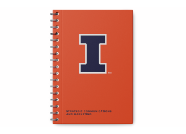
Whenever possible, the primary version of the logo (orange Block I with blue outline) should be used. When an application cannot accommodate the primary mark, use the orange and white or blue and white Block I logos. For products not available in orange or blue, the orange mark on white may be used.
The Block I logo without the wordmark is useful for applications that present significant space constraints, such as social media graphics, and when a design will be viewed from a distance, such as campus signage.
Clearance and Minimum Size
When appearing on its own, the clearance for the Block I must be equal to the height of the horizontal stroke. When the Block I has a crossbar, the minimum size is .25 inches for print and 30 pixels for screens. For rare instances when the Block I with the crossbar cannot be used, the limited-use mark may be used with a minimum size of .1 inches for print and 15 pixels for screens.
Limited-use Marks


Single-color marks are considered limited use and should only be used in cases where a two-color mark is not possible.
For merchandise not available in orange or blue, an orange mark on a white product may be used. The black, limited-use mark should only be used in pieces restricted to black and white printing methods, or as key art for techniques such as embossing or engraving.
Appropriate uses include:
- A print piece produced in black and white.
- Branded merchandise where two-color imprints or applications are not an option for that item or any comparable item.
- Cases of sponsorship or partnership in which a single-color mark has been specially requested (e.g., needing a one-color mark for placement alongside other sponsors on the back of a marathon t-shirt).
Inappropriate uses include:
- The footer of a unit or department website.
- On branded merchandise where two-color imprints or applications are an option.
- Any full-color printed materials.
Color Variation
The Block I logo should only appear on approved background colors and photos. For the orange and blue logo, approved backgrounds are white and light-colored photos. For the orange and white logo, approved backgrounds are blue and dark-colored photos. For the blue and white logo, approved backgrounds are orange and dark-colored photos.
If you’re unsure of which version of the logo to use on your background, use our Tab graphic element. The Tab element includes the Block I on an approved background color, with the clearance space around the Block I built in.


Trademark

The Block I logo must include the trademark symbol on all merchandise. This applies to items that are sold or given away for promotional purposes. The size of the trademark symbol may be adjusted by the printer if needed to optimize legibility or to accommodate a specific printing application. In very rare circumstances, you may omit the trademark on items if there are size restrictions preventing the use of the TM. The licensing vendor you are using is able to request this waiver from the Licensing and Trademark Office during the regular approval process. If you wish to obtain approval to omit the TM prior to working with your licensed vendor, please contact the Licensing and Trademark Office at licensing@illinois.edu. You can download a trademarked version from our downloads page.
All merchandise requires approval from the Trademark and Licensing Office. To obtain approval, a unit representative can submit a design with its intended use to licensing@illinois.edu. Alternatively, the manufacturer or licensee can submit for approval, where the licensing director will then notify approval, denial or necessary changes to the licensee. More information on merchandise can be found on the vendors and purchasing page.
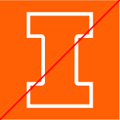
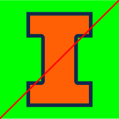
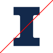
Improper Use
- Do not use the logo as a letter in a word or as a word in a sentence.

- Do not distort the logo.

- Do not change the color of the logo.

- Do not rotate the logo.

- Do not change the opacity of the logo.

- Do not visually group text with the logo, even if it falls outside the clearance zone.

- Do not combine additional elements with the logo to form a new mark.

Alt Text for Accessibility
When creating alt text for our logo, use the following recommendation. In general, alt text should use as few words as possible without being confusing. Drop leading descriptors such as “a” or “the,” as they are not needed for clarity.
Block I
Block I [in Illini orange, Illini blue, white, black]


Other Marks
University Seal
The University of Illinois System seal is to be used for academic purposes, formal university business transactions, legal transactions and some commercial uses as determined by the University of Illinois Board of Trustees. The seal is not available for download and special permission must be obtained for use.
All requests to use the seal must be made in writing, preferably by email, to the secretary at uibot@uillinois.edu.

Athletics Shield
The athletics shield, or victory badge, is used to represent the fight and honor of all Fighting Illini athletes and teams. This mark is limited to athletics applications only. The primary Block I logo is at the center of the badge encased by two facing Fs that symbolize the fight that Illini embody when they take the field of play. For more information, contact licensing@illinois.edu.