The consistent use of brand fonts adds visual strength to designs while reinforcing our Illinois brand.
Choosing the right typeface sets the tone for your design while reinforcing the brand identity. Do not deviate from these fonts for your university marketing and communications materials. To install these fonts, download them to your computer and follow the steps provided by Apple and Microsoft.
Primary Typefaces
Monserrat, Source Sans Pro and Georgia are our primary typefaces. They should make up the majority of your designs. All three of these fonts are free and often already installed on the programs you use.
Monserrat
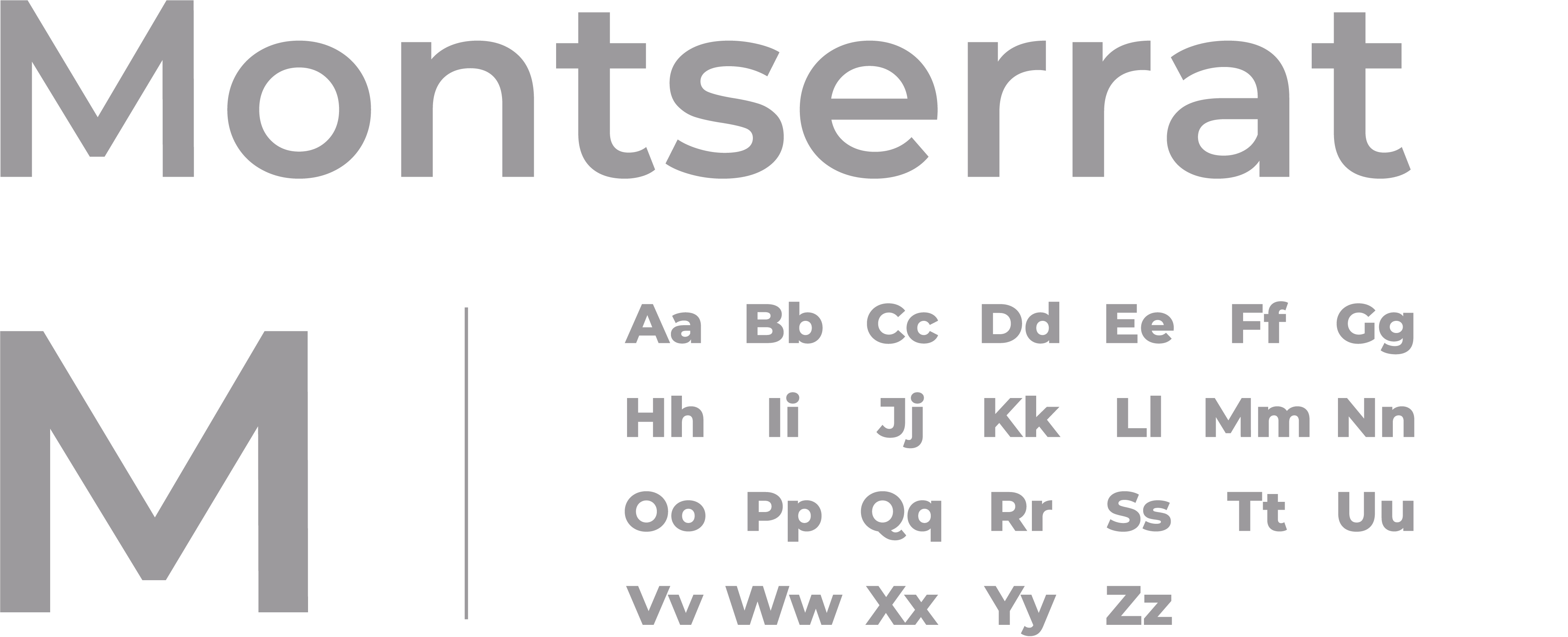
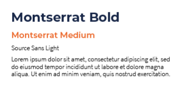
Montserrat is our headline typeface. We recommend heavier weights, but pairing those with a lighter weight can also give your headlines visual interest.
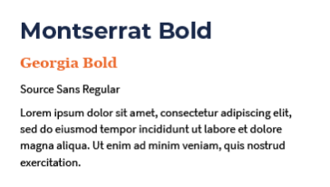
The typeface Montserrat was inspired by the signs and advertisements of the Montserrat neighborhood in Buenos Aires, Argentina. Montserrat has a geometric, modernist look and feel, with straight lines and circular forms. Given that its origins are in signage, Montserrat works very well as a headline and subhead.
It should be used for:
- Headlines.
- Subheadings.
- Large, stand-out numbers.
Source Sans
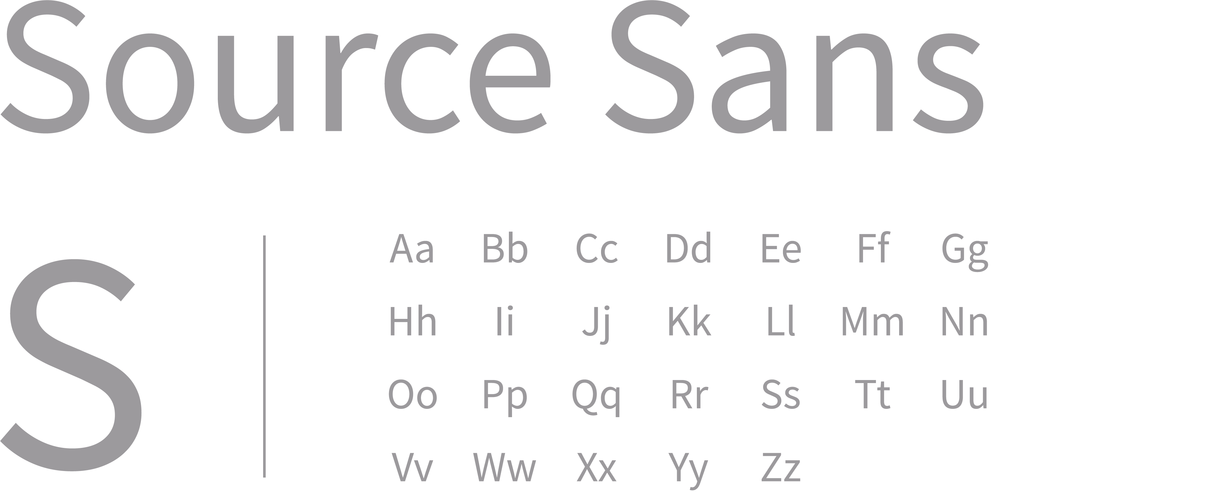
Source Sans is the workhorse of our brand typography. As Adobe’s first open source typeface family, this sans serif works well in many interfaces, making it the go-to option for the majority of your typography needs.
It should be used for:
- Headlines (heavier weights).
- Body copy, captions, charts and graphs (other weights).
Georgia

To set a more distinguished tone in your designs, consider incorporating Georgia, our serif typeface. While drawing influence from many older serif typefaces, Georgia was designed with clarity on digital screens in mind. With its wide range of weights and styles and great legibility, Georgia is best used for large blocks of text and subheadings. In comparison to Source Sans, Georgia can help imply a more elegant feel.
It should be used for:
- Large blocks of copy in print.
- Subheading.
- Quotes on the web.
- Legibility.
It should not be used for:
- Large blocks of copy in digital.
Special-use Typefaces
Occasionally, you made find a need for special-use typefaces that offer a more condensed or more playful option. For these cases, use Open Sans Condensed or Superfly.
Open Sans Condensed
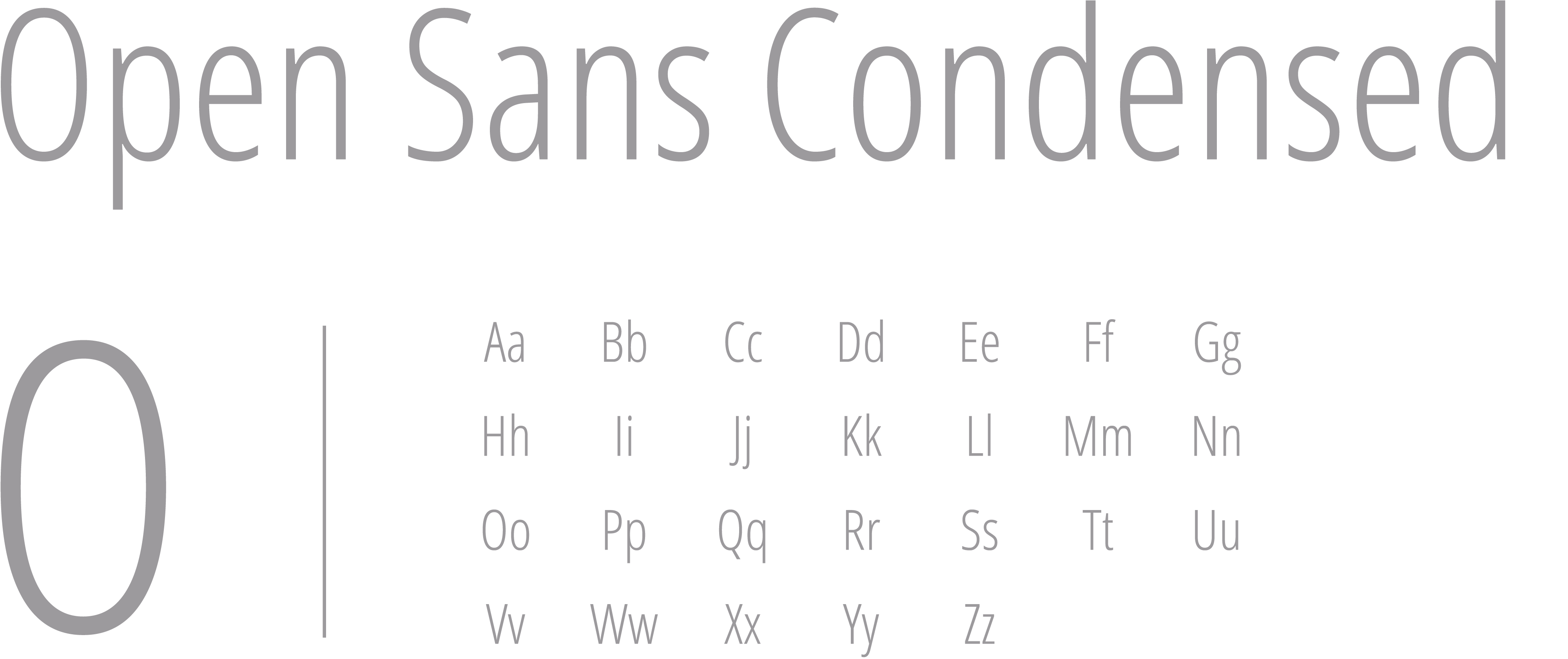
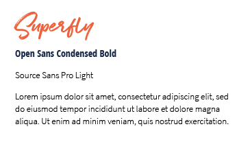
Open Sans Condensed provides a narrower option when there isn’t enough space to use our primary typefaces. While Open Sans provides other weights, only use condensed. This font should be used very sparingly and only when necessary.
It should be used for:
- In rare instances, with headlines and areas where space is tight (long headlines, name badges, etc.).
It should not be used for:
- Large sections of body copy.
- A replacement for our primary fonts if space allows.
Superfly
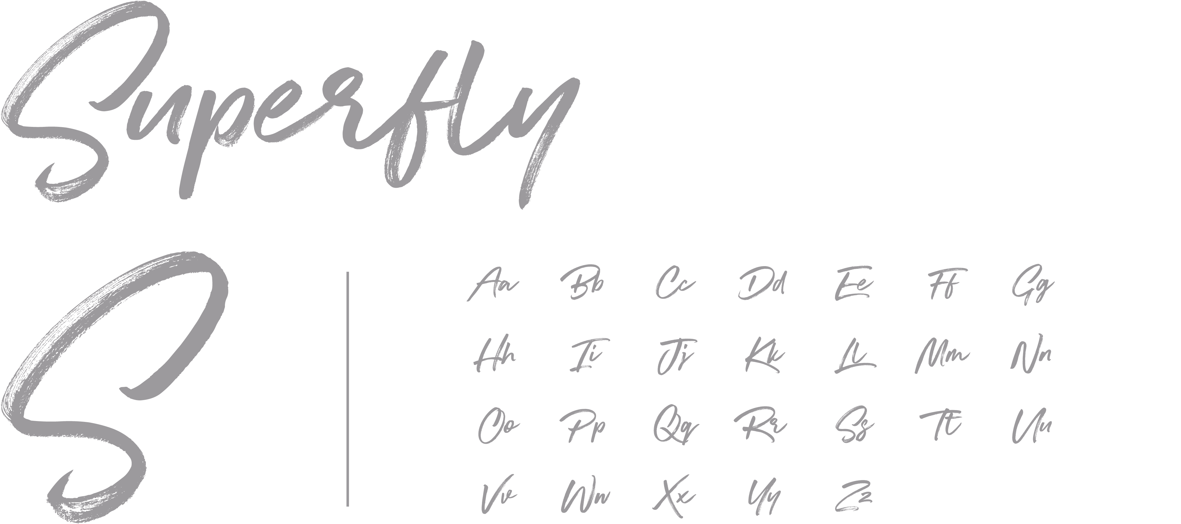
Sometimes it is helpful to add a more expressive font. Superfly adds a friendly element, but use it sparingly to achieve maximum impact. This is a paid font.
It should be used for:
- Emphasis on one or two important words in a headline.
- A graphic element.
- A way to convey playfulness.
It should not be used for:
- All caps.
- Multiple words.
Atkinson Hyperlegible
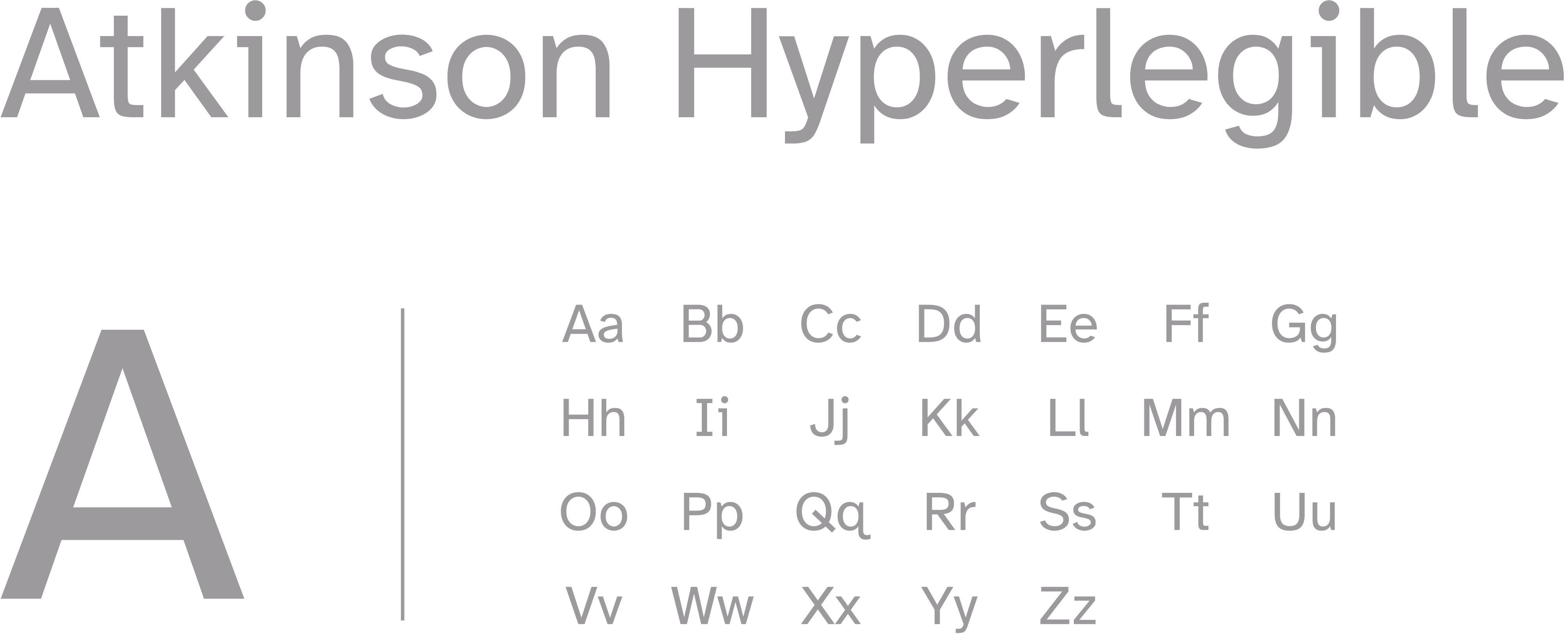
Atkinson Hyperlegible is the Braille Institute’s recommended typeface for the visually impaired.
Use this typeface when creating materials specifically for audiences with visual impairments.
Type Pairings
Need help with type pairings? Here are some examples to get you started.

Using Fonts
You do not need to use all fonts in a design and you should aim to use fonts that bring clarity to your design. Individual units may have more restrictive font selections than the university, but not additional fonts. However, if you have used vendors to develop typeface packages for your units as the brand guidelines were being developed, you may use them as you transition to the brand guidelines. Check with your college or governing unit for specialized guidance.
The Division of Intercollegiate Athletics uses a custom typeface and numeral set.
All of these assets are reserved for athletics use only.
Font uses
If you’re not sure what would work best for your designs, use our guidance on how to apply the brand fonts.
| Brand Font | Uses |
|---|---|
| Montserrat | Headings, Subheadings, Large stand-out numbers |
| Source Sans | Headlines (heavier weights), Body copy, Captions, Charts and graphs |
| Georgia | Large blocks of copy in print, Subheading, Quotes on the web |
| Open Sans Condensed | Name tags, Areas with tight space, Long headlines |
| Superfly | Headlines (used sparingly), One or two words used for emphasis |
Substitute fonts
We understand that you may not be able use the Illinois brand fonts everywhere. Sometimes Word documents, PowerPoint presentations and various digital applications require something different. For those instances, we’ve defined which fonts you can use in place of the brand fonts.
| Brand Font | Substitute |
|---|---|
| Montserrat | Arial Black |
| Source Sans | Arial |
| Georgia | Georgia |
| Open Sans Condensed | Arial Narrow |
| Superfly | No Available Substitute |
Leading, tracking and kerning
Using type thoughtfully is crucial to making our designs look professional. Follow these tips to make sure our typography is consistent.
Leading
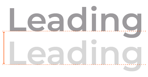
Leading refers to the vertical space between lines of text. It is named after the strips of lead historically used to separate lines of metal type in printing presses. Leading impacts the readability and overall aesthetics of a text by ensuring that lines are properly spaced, making it easier for readers to follow content.
Proper leading helps prevent text from appearing too cramped or too loose, and allows readers to navigate the text comfortably. With our typefaces, text generally looks best with the leading set slightly looser than the default.
Tracking
Tracking, also known as letter-spacing or character spacing, involves adjusting the overall spacing between all characters in a block of text or a selected range of text. It affects the spacing uniformly for all characters in the text, unlike kerning, which targets specific character pairs.
Tracking is used to adjust the overall density of text. You can increase tracking to create more open and airy text for display purposes or decrease tracking to enhance readability in longer passages of text.
Kerning

Kerning is the adjustment of the space between individual pairs of letterforms. It’s used to fine-tune the spacing between specific characters to ensure that they visually align. Kerning is typically applied to address specific instances where characters might overlap or have awkward gaps.
Kerning is most often used for characters that have irregular shapes or combinations that don’t naturally fit together, such as “AV,” “To,” or “Te.” By manually adjusting the kerning, you can achieve a more visually balanced appearance for these character pairs.
Web fonts
The University of Illinois default web fonts — Montserrat, Source Sans Pro and Georgia — provide consistent type styles across print and digital mediums.
Use Source Sans as the primary font in electronic communications whenever possible.
The font files may be hosted only on websites with *.illinois.edu domains.
Hosted brand assets for web
Our font files have been added to the collection of hosted brand assets, also known as a content delivery network (CDN), so you can implement them to your website with simplified variable names. Find the documentation on all the hosted brand assets.